How to Read Stock Charts: Quick-Start Guide


Many or all of the products featured here are from our partners who compensate us. This influences which products we write about and where and how the product appears on a page. However, this does not influence our evaluations. Our opinions are our own. Here is a list of our partners and here's how we make money.
The investing information provided on this page is for educational purposes only. NerdWallet, Inc. does not offer advisory or brokerage services, nor does it recommend or advise investors to buy or sell particular stocks, securities or other investments.
Learning how to read stock charts can be useful to figure out if a company is doing well.
Google's stock charts show basic data such as open, close and intraday prices.
Learning how to interpret earnings and dividend data — as well as how to recognize chart patterns like support and resistance — can help inform your trading decisions.
At first glance, stock charts seem like a chaotic bunch of lines, numbers and acronyms. But once you cut through the jargon, you'll find that these data sources are a great way to examine a company's performance over time.
Stock charts can be useful for investors looking to figure out whether a firm has earned your investment dollars. But even if you're not picking individual stocks, these charts can be a good resource for understanding publicly available data.
Perhaps you're weighing a job offer, looking at economic trends among companies in your region, or pitching potential clients at a firm. Looking at stock data can give you a better sense of what's going on at a company.
» Learn more: How to invest in stocks (no technical analysis required)
Stock chart components
One of the most convenient ways to learn about stock charts is through Google. Just search a company’s ticker, and you’ll see a simple chart that’s the equivalent of the shallow end of the pool during a swim lesson. (Don’t know the company’s ticker symbol? You can search online for that.)
As an example, let’s look at Apple (AAPL), one of the largest stocks by weight in the S&P 500.
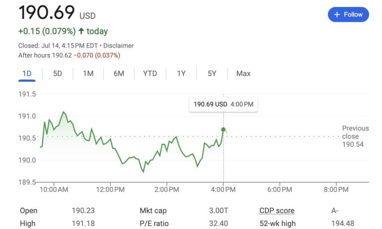
This chart shows the stock price was $190.69 at the market close on July 14, 2023. Closing price refers to the last price a stock traded for during regular market hours — 9:30 a.m. to 4 p.m. Eastern Time. During regular trading hours, the price will likely fluctuate. The “after hours” price is $190.62, reflecting the price the stock was currently being traded for outside of regular hours. (Learn more about after-hours trading, and how it differs from conventional investing.)
We can also see the stock price “closed” 15 cents higher than it did on the previous trading day (when the close price was $190.54), meaning the price rose by about .08%. The green line shows the various price changes throughout the day, but choosing any of the other time periods would show the various price changes throughout that span of time.
That line, denoting price increases and decreases over a specified period of time, makes up the backbone of most stock charts. The y-axis (vertical axis) shows prices in dollars, while the x-axis (horizontal axis) shows how much time has passed in the chosen period. In this chart, the gray line shows how the stock is performing during after-hours trading.
» Start analyzing: Check out our list of the best online brokers for stock trading.
NerdWallet rating 4.9 /5 | NerdWallet rating 5.0 /5 | NerdWallet rating 4.1 /5 |
Fees $0 per online equity trade | Fees $0 per trade | Fees $0 per trade |
Account minimum $0 | Account minimum $0 | Account minimum $0 |
Promotion None no promotion available at this time | Promotion None no promotion available at this time | Promotion Get up to $700 when you open and fund a J.P. Morgan Self-Directed Investing account with qualifying new money. |


Basic stock chart terms to know
Open, high, low and previous close. The open is the first price at which a stock trades during regular market hours, while high and low reflect the highest and lowest prices the stock reaches during those hours, respectively. Previous close is the closing price of the previous trading day.
Market cap. Shown here as “Mkt cap,” market cap means market capitalization, which measures the size of a company based on the number of its shares on the stock market multiplied by its current share price. In Apple’s case, your eyes do not deceive you: That’s a market cap of $3 trillion — one of the largest in the world. (Learn more about market capitalization.)
PE ratio. This stands for price-to-earnings ratio, which some investors may use to decide if a stock is undervalued, overvalued or fairly valued. (Get the details on PE ratio.)
Dividend yield. Shown here as “Div yield,” dividend yield tells you how much an investor may receive annually in dividends (cash payments companies may offer to shareholders), expressed as a percentage of the current share price. Apple’s quarterly dividend for the past four quarters was about 23 cents per share. Over a full year, it paid out 93 cents, which is about 0.5% of its current share price. (Learn more about dividends.)
52-wk high and low. 52-week high is the highest price the stock has traded for during the preceding 52 weeks, while the 52-week low is (you guessed it) the lowest price the stock has traded for during the preceding 52 weeks.
More advanced stock chart terms
Google’s charts are pretty bare-bones, making them a great place to learn. But once you start studying more advanced charts, you’ll run into a few more terms worth knowing.
Bid and ask
The bid is the highest price an investor is willing to pay for a stock. If you see, for example, $100 as the bid, investors are currently willing to buy the stock at a price of $100 per share. The ask, on the other hand, is the lowest price an investor is willing to sell a stock for. If you see an ask of $100.05, sellers are currently selling for $100.05 per share.
Note there’s a 5 cent difference between the two — this is called the bid-ask spread. Generally, when there’s high trading activity with lots of willing buyers and sellers, spreads will be smaller. With less trading activity (such as during after-hours trading or trading in less popular stocks), bid-ask spreads may be wider. And when spreads are wider, it may be more difficult for an investor’s trade to be executed, or for the trade to go through at the price they wanted.
Volume, average volume and day’s range
Volume represents the number of shares that have been traded so far that day, while average volume is the average daily volume for a specified period. Day’s range shows the highest and lowest prices the stock has traded for up to the current moment of that trading day.
Beta
A stock's beta shows how volatile a stock’s price is compared with the stock market, which may be an indicator of how risky the stock is. If beta is greater than one, the stock has historically been more volatile than the stock market (typically represented by either the S&P 500 or a total stock market index) for the specified period. If beta is less than one but greater than zero, it’s been less volatile than the overall market for that period. As always, though, past performance isn’t indicative of future performance.
EPS (TTM) and earnings date
EPS (TTM) stands for earnings per share for the last 12 months (or, technically, “trailing 12 months”), and that number is the “E” in PE ratio. You can get this number by dividing the most recently reported company earnings by the number of the company’s shares available on the stock market. The earnings date is the publicly displayed window of time for when the company will announce its latest quarterly earnings.
Ex-dividend date
In order to receive the company’s dividend for the next period, you’ll have to become a shareholder (that is, buy its stock) before the ex-dividend date. If you buy the stock on or after the ex-dividend date, you won’t get the dividend for that period. As far as dividends go, procrastination doesn't pay.
1-year target estimate
This is an estimate of what the stock’s price could be in one year. This reading often represents a consensus of many analysts’ one-year price targets, but be aware that while analysts use complicated calculations to arrive at their estimates, it’s still just a forecast. And as anyone who’s been annoyed with their local meteorologist knows, forecasts can be wrong.
Moving averages
A moving average is a stock's average price over a particular period of time. It changes every day, hence the "moving" part.
For example, the 50-day simple moving average (SMA) of a stock is its average price over the last 50 days, while the stock's 200-day SMA is its average price over the last 200 days.
Exponential moving averages (EMAs), on the other hand, use a weighted formula that causes them to change more rapidly in response to recent price changes. Many stock charting platforms allow you to overlay moving averages onto a chart of a stock's price. The intersections between different moving averages can be useful trading signals.
Support and resistance
Another overlay featured offered by many charting platforms is the ability to draw support and resistance lines on a stock's price chart.
Support is the lower-bound of a stock's price over a given period of time — it's a level that the stock might approach, but never seems to dip below.
Conversely, resistance is the upper-bound of a stock's price over a particular period. A stock might get close to its resistance level, but it generally doesn't exceed it.
When the price of a stock does break below its support level or above its resistance level, however, that can be a significant trading signal.

Types of stock charts and how to read them
There are a lot of different ways to analyze all the data in an advanced chart. Moving average crossovers and support or resistance levels are by no means the only stock chart patterns worth learning about — but they're two of the most well-known types.
Golden crosses and death crosses
One way to use moving averages is to look for points where a short-term moving average crosses over or under a long-term moving average.
For example, the chart below shows the price of Apple in red and green candlesticks, as well as Apple's 50-day SMA in orange and its 200-day SMA in blue.
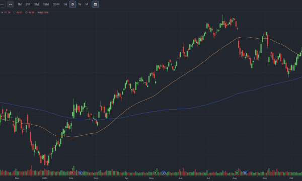
Source: Finviz. Chart is current as of Oct. 26, 2023 and is intended for informational purposes only, not for trading purposes.
If a stock's 50-day moving average crosses above its 200-day moving average, that's called a "golden cross" and is considered a bullish signal for a stock. In the chart above, Apple experienced a steady uptrend for several months following its golden cross.
On the other hand, if a stock's 50-day moving average is running above its 200-day moving average and crosses below it, that's called a "death cross" and is considered a bearish signal.
Testing a resistance level
Support and resistance levels are some of the simplest patterns in stock chart analysis. If the price goes above a resistance level, that's generally a bullish signal, and if it falls below a support level, that's generally a bearish signal.
But "testing" a resistance level — repeatedly touching it without breaking through it — can also be a bearish signal if it indicates a "failure" to break out of that resistance.
For example, the chart below shows the price of Nike (NKE) in red and green candlesticks, along with a resistance level at $130 in blue.
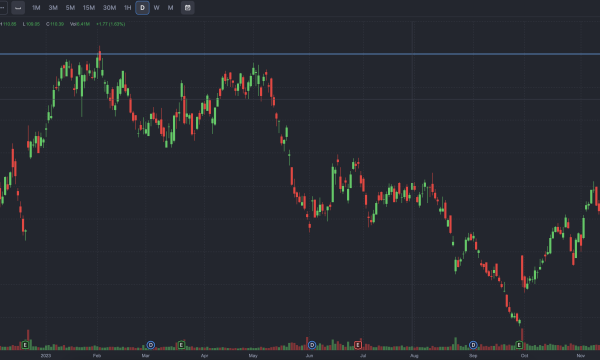
Source: Finviz. Chart is current as of Nov. 28, 2023 and is intended for informational purposes only, not for trading purposes.
Nike's price briefly touched the $130 resistance level, but then retreated from it and failed to break it again. Following this second unsuccessful attempt to break $130, the stock entered a sustained downtrend for several months.
» Want to start practicing? Finviz, used to generate the charts above, has several free charting tools.
The bottom line on how to read stock charts
Stock charts contain a ton of information. They can help you make smarter trading decisions, but they can also be overwhelming.
If you start by learning basic price terms like high, low, open and close, move on to some basic metrics like dividend yield and PE ratio, and then start to recognize some basic patterns, you'll be well ahead of many investors in learning how to read stock charts.
As you continue learning about stock charts, keep a few points in mind:
It’s rare for a stock to move in one direction. Swings are normal.
What appears to be a big spike or slump may not be. Look at the y-axis; prices may range from a few cents’ difference to a few dollars, depending on the stock.
Even if a stock price is rising in the short term, that increase may be a blip amid a prolonged decline. Look at longer time horizons (one, three and five years) for a more complete picture of trading activity.
Not all charts will be right for your time horizon. Poring over an intraday price chart, which looks at one day’s fluctuations, won’t make sense for someone who plans to be invested for 20 years. A day trader, however, may find it helpful.
On a similar note...