Join our Nerds
If you're ready to help bring clarity to the finance world while doing the best work of your career, we're ready for you.

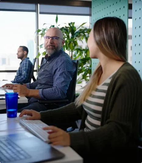
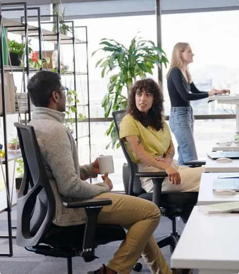
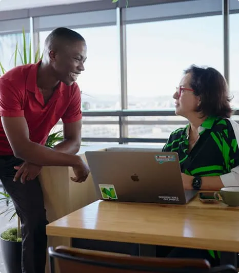
Bring your best every day
When you're at your best, it elevates those around you. We prioritize speaking candidly, treating others respectfully, and humbly embracing what we don't know. Our inclusive environment ensures every Nerd feels safe to be themselves — and to do their best work.
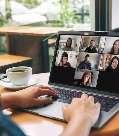
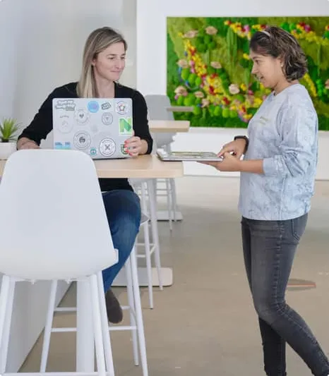
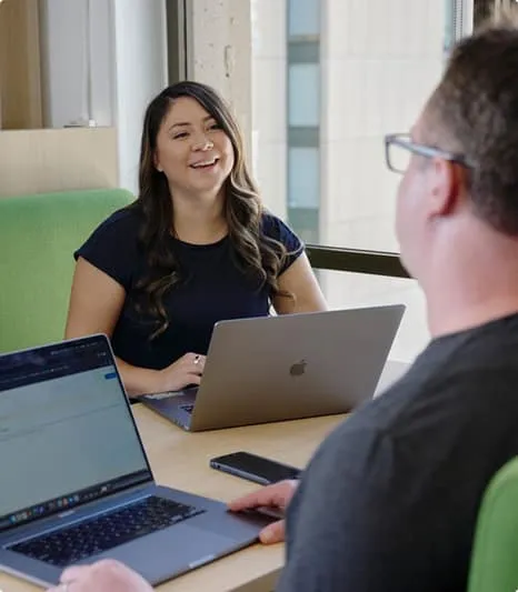
Working remotely works for NerdWallet
While we've got offices in San Francisco, New York, and the UK, we've transitioned to a remote-first workplace with most of our jobs offered as fully remote from anywhere in the U.S.

Proud to be recognized as a great place to work
Named a 2024-2025 Best Company to Work For by U.S. News & World Report
Nerdy perks and benefits
We value our Nerds and know that happy, fulfilled people do their best work. With competitive health insurance for you and your whole family, mental health support, retirement plans, a commitment to employee growth and empowerment, plus a great work-life balance, our perks and benefits help our Nerds remain exceptional.

Diversity, Equity, and Inclusion Programs at NerdWallet
At NerdWallet, we aspire to provide people with the confidence they need to live their best lives—however they identify. This means fostering an inclusive culture that allows all Nerds to grow their skills, contribute, and thrive with the confidence of belonging.
Visit our DEI page to learn about our current and ongoing efforts.
Visit our DEI page to learn about our current and ongoing efforts.
What our Nerds are saying

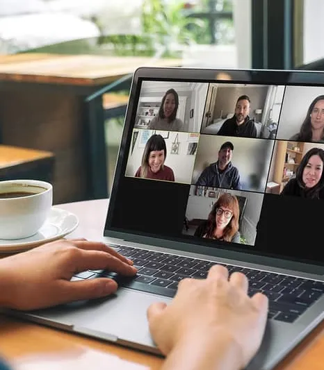
“Having joined as a remote Nerd, I wasn't sure what it would be like to work with teams I'd never met in person. But through fun and interactive Slack channels, thematic happy hours, and inclusive team meetings, I've never felt out of place. We all belong here.
Luis,
Product Analytics Nerd
Product Analytics Nerd
“I'm thankful to work at a company that supports me as an employee and as a parent. From flexible scheduling so that I can pick up my daughter from school to designated company-wide Mental Health Days, to generous parental leave, NerdWallet allows me to bring my whole self.
Rachel,
People Operations Nerd
People Operations Nerd
“Being at NerdWallet creates so many opportunities for cross-functional collaboration! Nerds are encouraged to reach out well beyond their primary teams to tackle challenges in delivering nerdy expertise to our appreciative users.
Hass,
Product Design Nerd
Product Design Nerd

“A lot of companies say they're consumer-first, but I've never had a workplace strive to put real people front and center quite like NerdWallet. It's clear Nerds care deeply about the humans we serve.
Kimra,
User Experience Nerd
User Experience Nerd
“Curiosity is a powerful thing, and it's what excites me about coming to work every day. NerdWallet has built a culture of openness and willingness to challenge our own assumptions and status quo — giving everyone more opportunity to be creative, collaborative, and impactful.
Jon,
Brand Studio Nerd
Brand Studio Nerd

“NerdWallet has provided me the freedom to be my full self in the workplace, and that commitment to its employees' full self has attracted a diverse array of hard-working, talented coworkers.
Gerard,
Performance Marketing Nerd
Performance Marketing Nerd
“Every day I've worked here, I've had the privilege of engaging with smart and just plain nice people. Everyone is committed to learning and growing, and is gracious with time and support.
Sharadh,
Engineering Nerd
Engineering Nerd
“You're given a lot of ownership from the beginning. It may be frightening at the start, but you are surrounded with brilliant colleagues who are rooting for your success. You are able to flex your strengths here and as a team, make an impact for NerdWallet's customers.
Yuri,
Product Management Nerd
Product Management Nerd
“Having joined as a remote Nerd, I wasn't sure what it would be like to work with teams I'd never met in person. But through fun and interactive Slack channels, thematic happy hours, and inclusive team meetings, I've never felt out of place. We all belong here.
Luis,
Product Analytics Nerd
Product Analytics Nerd
“I'm thankful to work at a company that supports me as an employee and as a parent. From flexible scheduling so that I can pick up my daughter from school to designated company-wide Mental Health Days, to generous parental leave, NerdWallet allows me to bring my whole self.
Rachel,
People Operations Nerd
People Operations Nerd

“Being at NerdWallet creates so many opportunities for cross-functional collaboration! Nerds are encouraged to reach out well beyond their primary teams to tackle challenges in delivering nerdy expertise to our appreciative users.
Hass,
Product Design Nerd
Product Design Nerd
“A lot of companies say they're consumer-first, but I've never had a workplace strive to put real people front and center quite like NerdWallet. It's clear Nerds care deeply about the humans we serve.
Kimra,
User Experience Nerd
User Experience Nerd

“Curiosity is a powerful thing, and it's what excites me about coming to work every day. NerdWallet has built a culture of openness and willingness to challenge our own assumptions and status quo — giving everyone more opportunity to be creative, collaborative, and impactful.
Jon,
Brand Studio Nerd
Brand Studio Nerd
“NerdWallet has provided me the freedom to be my full self in the workplace, and that commitment to its employees' full self has attracted a diverse array of hard-working, talented coworkers.
Gerard,
Performance Marketing Nerd
Performance Marketing Nerd

“Every day I've worked here, I've had the privilege of engaging with smart and just plain nice people. Everyone is committed to learning and growing, and is gracious with time and support.
Sharadh,
Engineering Nerd
Engineering Nerd

“You're given a lot of ownership from the beginning. It may be frightening at the start, but you are surrounded with brilliant colleagues who are rooting for your success. You are able to flex your strengths here and as a team, make an impact for NerdWallet's customers.
Yuri,
Product Management Nerd
Product Management Nerd
Get social with us
Subscribe to our YouTube channel