

NerdWallet Logo Usage Guidelines
Three easy steps for use
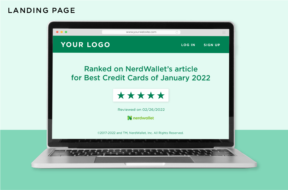
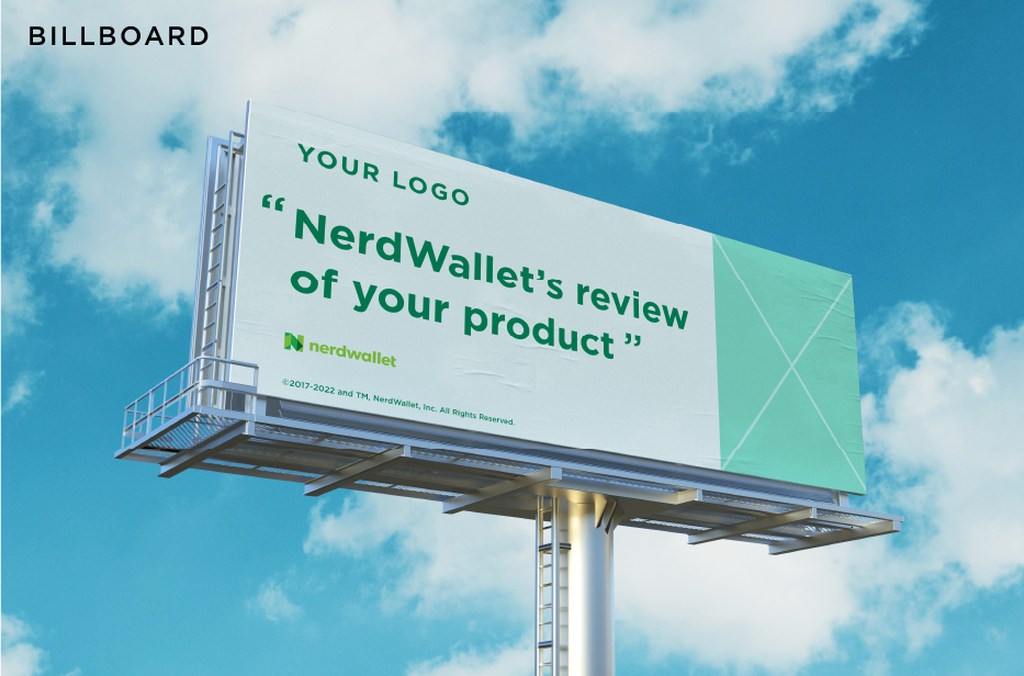
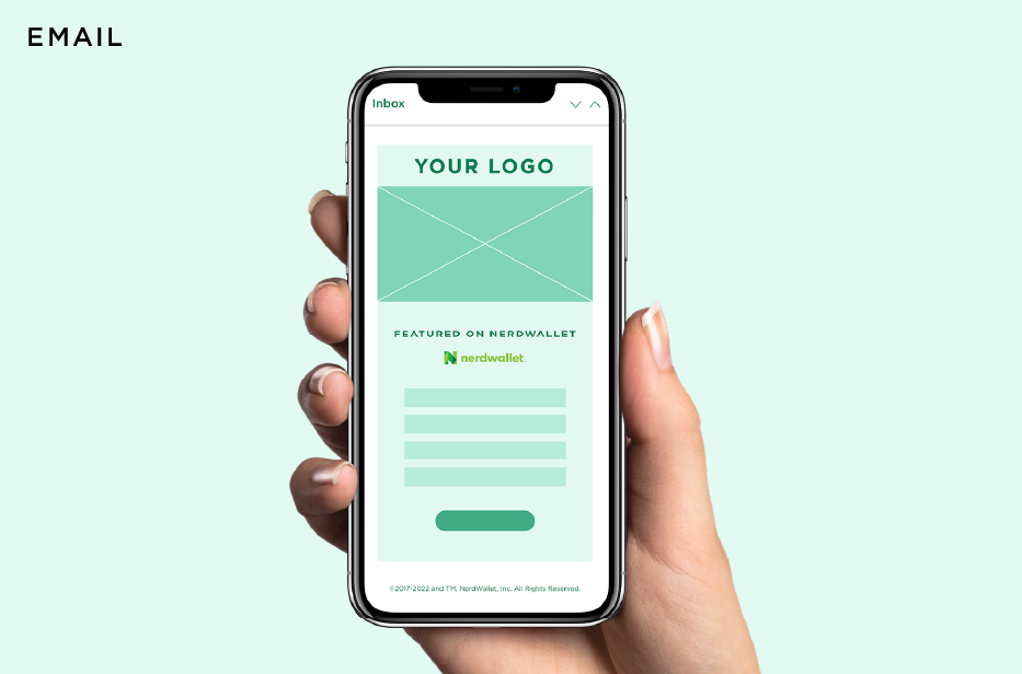
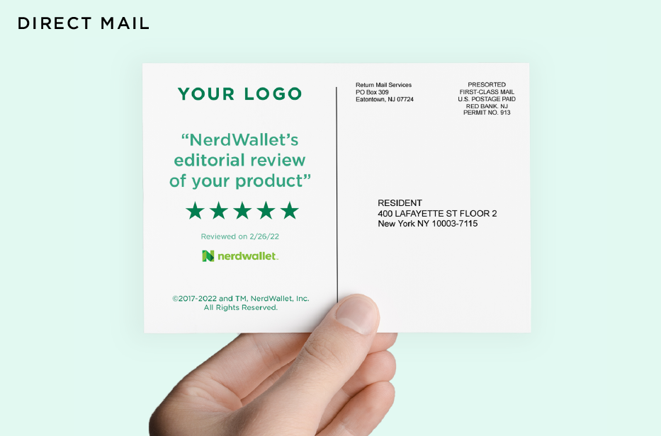
Whether you're using NerdWallet 5-star review in a consumer email, a quote from our editorial review on social media, or share your product as one of our top picks on your landing page, we've got you covered. Here's some tips to get you quickly approved.
STEP 1
Mock-up your marketing materials with the NerdWallet logo, review, or quote that you'd like to feature with these legal requirements in mind.
1. Trademark License: Your use of the NerdWallet logo is subject to the trademark license previously granted to you and these guidelines. If you have not entered into a trademark license with NerdWallet, contact [email protected]. NerdWallet may, in its sole discretion, rescind your use of the NerdWallet logo at any time without notice for failure to comply with the license and these guidelines.
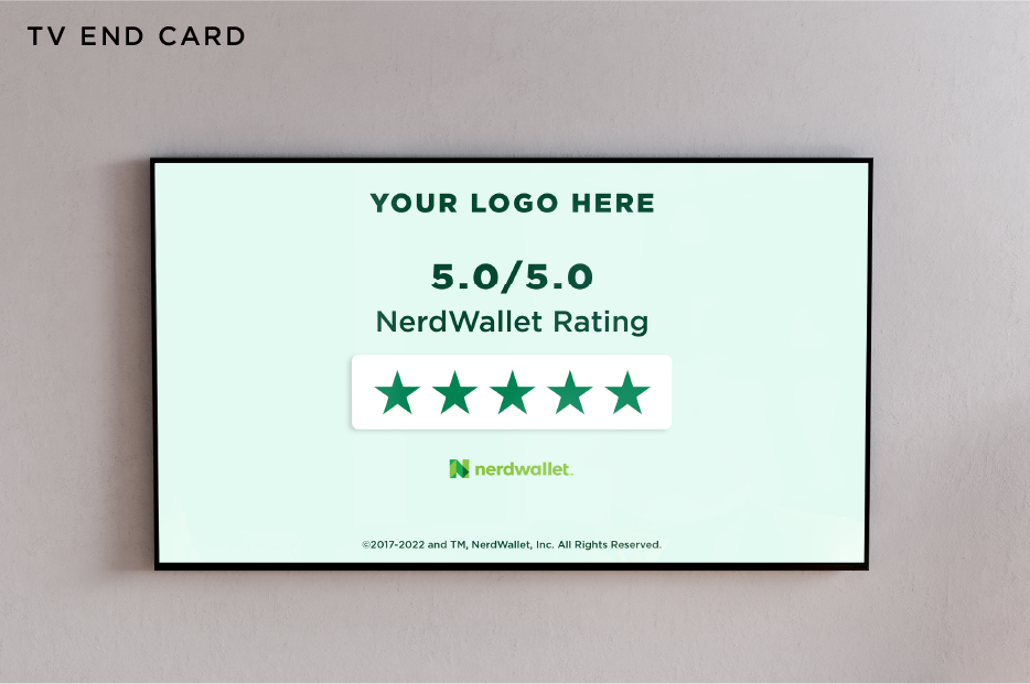
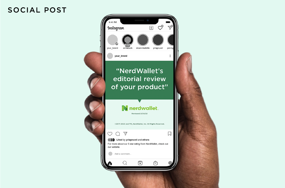
2. Must Include Date: If you’re mentioning a NerdWallet article, review or editorial quote, you must include the date (month and year) that it was written near the usage of the quote/rating.
3. Trademark Line: Whenever you use NerdWallet’s logo in your marketing materials, you must include this legal trademark line as close to the mention as possible: "©2014-2024 and TM, NerdWallet, Inc. All Rights Reserved." (or “NerdWallet and the NerdWallet logo are trademarks owned by NerdWallet, Inc. and used with permission.”)
4. Truthful Representation: You may not edit a quote such that it changes the meaning of the original statement or takes the statement out of context.
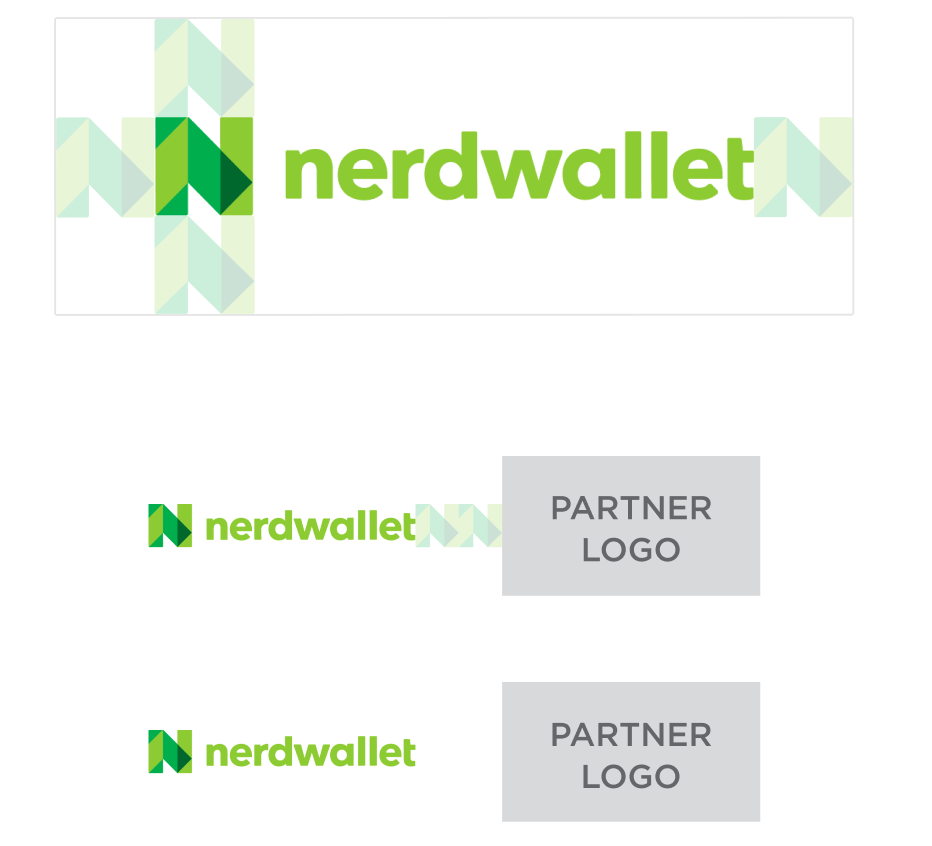
5. Logo and Word Mark Usage: The marketing asset must not imply your product or services are co-branded with or in any way offered by NerdWallet. Therefore please observe the following rules:
• Assets cannot include ‘in partnership with NerdWallet’ or similar statements in the copy / creative.
• Assets cannot imply, through placement of the NerdWallet logo or other design elements in the asset, that your products or services are co-branded, co-owned or offered in partnership with NerdWallet.
• NerdWallet logo may be no greater than half the size of the partner logo and partner logo must have noticeably greater prominence on the page than the NerdWallet logo.
• NerdWallet logo cannot be placed near offers, ads, other pricing and/or financial terms.
• Your brand logos or name should not appear side-by-side with the NerdWallet logo as it can be confusing for the consumer.
• If you are a NerdWallet referral partner and you are using the NerdWallet logo on a landing page that receives traffic from a widget, lead form, or advertising asset located on a NerdWallet page, please use the NerdWallet logo in the same sentence as a statement such as “Welcome NerdWallet Users”, “Thanks for coming from NerdWallet”, or other similar statement that clarifies NerdWallet’s relationship to your brand and its role on the landing page.
6. You may not display the NerdWallet logo: (a) with any material that relates to violence, sex, profanity, racism, sexism, religion, gambling, pornography, abortion, or any other highly explosive subject matter or subject matter which reflects negatively on NerdWallet; (b) in any way that denigrates a competitor of yours; or (c) in any manner which reflects poorly on or may damage the goodwill associated with or the reputation of NerdWallet.
2. Must Include Date: If you’re mentioning a NerdWallet article, review or editorial quote, you must include the date (month and year) that it was written near the usage of the quote/rating.
3. Trademark Line: Whenever you use NerdWallet’s logo in your marketing materials, you must include this legal trademark line as close to the mention as possible: "©2014-2024 and TM, NerdWallet, Inc. All Rights Reserved." (or “NerdWallet and the NerdWallet logo are trademarks owned by NerdWallet, Inc. and used with permission.”)
4. Truthful Representation: You may not edit a quote such that it changes the meaning of the original statement or takes the statement out of context.
5. Logo and Word Mark Usage: The marketing asset must not imply your product or services are co-branded with or in any way offered by NerdWallet. Therefore please observe the following rules:
• Assets cannot include ‘in partnership with NerdWallet’ or similar statements in the copy / creative.
• Assets cannot imply, through placement of the NerdWallet logo or other design elements in the asset, that your products or services are co-branded, co-owned or offered in partnership with NerdWallet.
• NerdWallet logo may be no greater than half the size of the partner logo and partner logo must have noticeably greater prominence on the page than the NerdWallet logo.
• NerdWallet logo cannot be placed near offers, ads, other pricing and/or financial terms.
• Your brand logos or name should not appear side-by-side with the NerdWallet logo as it can be confusing for the consumer.
• If you are a NerdWallet referral partner and you are using the NerdWallet logo on a landing page that receives traffic from a widget, lead form, or advertising asset located on a NerdWallet page, please use the NerdWallet logo in the same sentence as a statement such as “Welcome NerdWallet Users”, “Thanks for coming from NerdWallet”, or other similar statement that clarifies NerdWallet’s relationship to your brand and its role on the landing page.
6. You may not display the NerdWallet logo: (a) with any material that relates to violence, sex, profanity, racism, sexism, religion, gambling, pornography, abortion, or any other highly explosive subject matter or subject matter which reflects negatively on NerdWallet; (b) in any way that denigrates a competitor of yours; or (c) in any manner which reflects poorly on or may damage the goodwill associated with or the reputation of NerdWallet.
STEP 2
Send the final mock of the creative using NerdWallet’s logo or name to [email protected].
STEP 3
NerdWallet's brand approvals team will respond to your email request with feedback / approval within 48 hours.
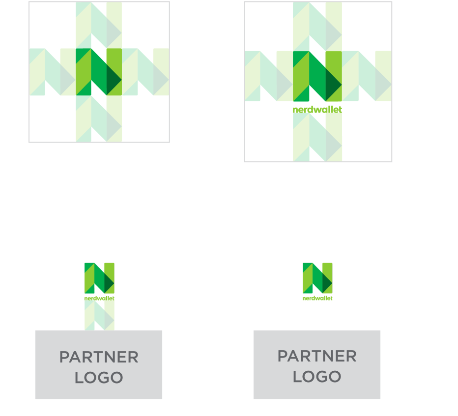
Partner Logo Guidelines
Clearspace
Clearspace is the specific amount of space that a logo must have on all sides, no matter where it is used. The reason for clearspace is to ensure that a logo maximizes visibility and impact. Our logo must have clearspace that is the size of the N mark at usage size. For partner marketing and locking up with another brand logo, the clearspace must be 2x the N mark. If using the vertical logo, the logomark at size should be the measurement.
Get your creative wheels turning
We’ve seen partners use the NerdWallet logo in all sorts of creative ways. See some mockup inspiration below.
Feel free to send any other questions to [email protected].
Download logos
By downloading our assets, you're agreeing to our terms of service.